Welcome to the Hardcore Husky Forums. Folks who are well-known in Cyberland and not that dumb.
UW marketing = dumpster fire

jecornel
Member Posts: 9,737
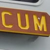
So far the clothing selection for Addidas is pourous. The quality of the shirts is terrible, the embroidery was crooked and had gaps on the Addidas emblem. Color schemes didn't work. Basically no selection and the price point is too high. The first image is not Adidas but why make a brown sweatshirt?


Comments
-
That's the new gold. Sadly.
-
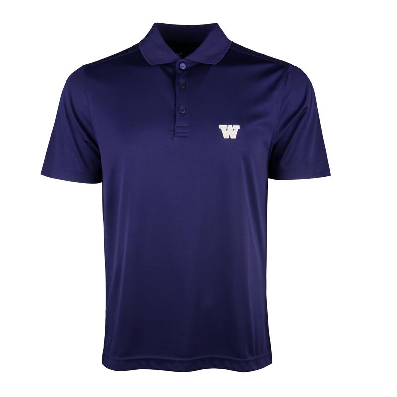
Yeah, I ended up buying a Cutter & Buck polo shirt.
-
This stuff is not hard. It really isn't.
The away Jersey number font is as bad as the black sleeves for Nike home Jersey.
Stick with the block font....I mean come on! -
Were there any pink tutus for sale?
-
Probably. Plenty of rainbow swag around.whatshouldicareabout said:Were there any pink tutus for sale?
-
Probably. Plenty of rainbow swag around.whatshouldicareabout said:Were there any pink tutus for sale?
Abundance!
Rainbow swag AND Oink tutus. -
Fred Meyers?jecornel said:So far the clothing selection for Addidas is pourous. The quality of the shirts is terrible, the embroidery was crooked and had gaps on the Addidas emblem. Color schemes didn't work. Basically no selection and the price point is too high. The first image is not Adidas but why make a brown sweatshirt?
-
Abundance!EwaDawg said:
Probably. Plenty of rainbow swag around.whatshouldicareabout said:Were there any pink tutus for sale?
Rainbow swag AND Oink tutus.
Chinned for Oink. -
UW book store.MikeDamone said:
Fred Meyers?jecornel said:So far the clothing selection for Addidas is pourous. The quality of the shirts is terrible, the embroidery was crooked and had gaps on the Addidas emblem. Color schemes didn't work. Basically no selection and the price point is too high. The first image is not Adidas but why make a brown sweatshirt?
-
This is horrific