Welcome to the Hardcore Husky Forums. Folks who are well-known in Cyberland and not that dumb.
The Canadian Dream

BennyBeaver
Member Posts: 13,346
in Tug Tavern

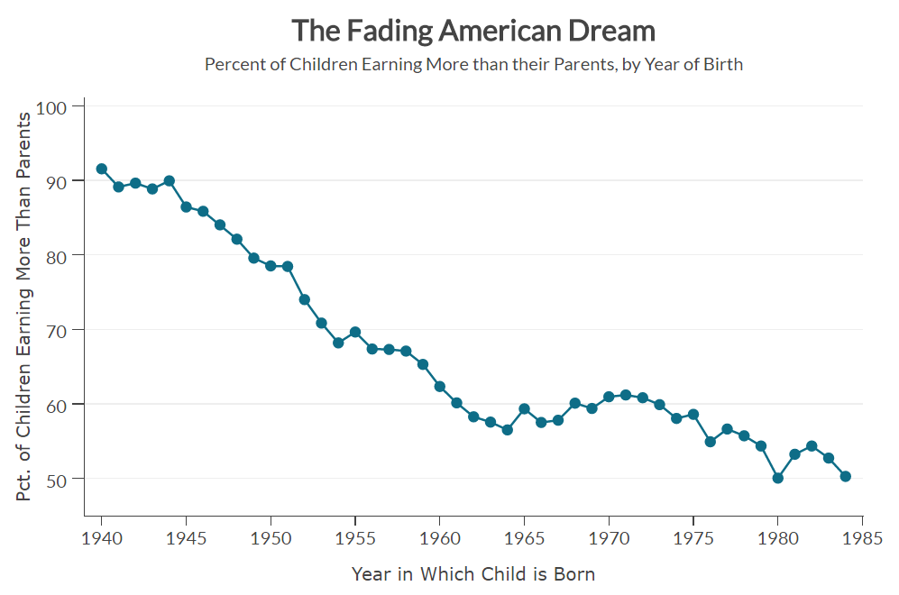
And so you can basically ask, taking say, all of the kids born in America in the 1980s, “What fraction of the kids born to low-income families actually make it to the top of the income distribution? How much intergenerational mobility is there in America?” In the U.S., if you take, say, the set of children who are born to families in the bottom quintile of the income distribution, in the bottom fifth, about seven-and-a-half percent of those kids make it to the top fifth of the income distribution... it’s useful to start first by thinking about comparisons across countries. So if you look at that number in other countries where we have comparable data, like the United Kingdom, for instance. In the U.K., that number is nine percent. A little bit higher, but not all that much higher. If you go to a place like Canada or Denmark, the number is 13 percent, or 13 and a half percent. That’s quite a bit higher. And it’s useful, in thinking about these numbers, is 13 percent a big number? Well, you have to remember, of course, that no matter what you do, you can’t have more than 20 percent of people in the top 20 percent, right? So the maximum value this statistic can take, I think, is plausibly 20 percent. To put it more precisely, if you lived in a society where your parents played no role at all in determining your outcomes, we’d expect one-fifth of kids to rise from the bottom 20 percent to the top 20 percent. And so relative to that benchmark, that upper bound, if you will, the 13 and a half percent rate in Canada and the seven-and-a-half percent rate in the U.S., that’s a really big difference. It’s almost like you’re twice as likely to realize the American dream of moving up if you’re growing up in Canada rather than the U.S, right?http://freakonomics.com/podcast/american-dream-really-dead/
...Or perhaps more precisely, we should just call it the Canadian Dream instead of the American Dream, if they’re twice as good.
Comments
-
Yeah, but then you have to watch curling. I'd rather be poor.
-
Without any research into the numbers, I would think someone born in 85 is still breaking into whatever industry while their parents are probably just retiring or sitting atop the perch of their career.
-
Freakonomics is your source?
-
Sounds like you need to dig a little deeper.Doogles said:Without any research into the numbers, I would think someone born in 85 is still breaking into whatever industry while their parents are probably just retiring or sitting atop the perch of their career.
-
Let's not be so hasty now...Swaye said:Yeah, but then you have to watch curling. I'd rather be poor.


-
She keeps that Plunger thing behind her back for the propitious time - then she rams it in....which might be ok...PurpleThrobber said: -
Looks like Obama really screwed the pooch there.
-
The Canadian dream for America is a liberal crossing over to Canada with an illegal under each arm!
-
Causation:
Low skilled jobs leave the country, and families then create generations of entitlement households.
Going from a 66 percent labor participation rate to a 62 percent level kind of skews your graph a bit. -
You drunk?greenblood said:Causation:
Low skilled jobs leave the country, and families then create generations of entitlement households.
Going from a 66 percent labor participation rate to a 62 percent level kind of skews your graph a bit.


