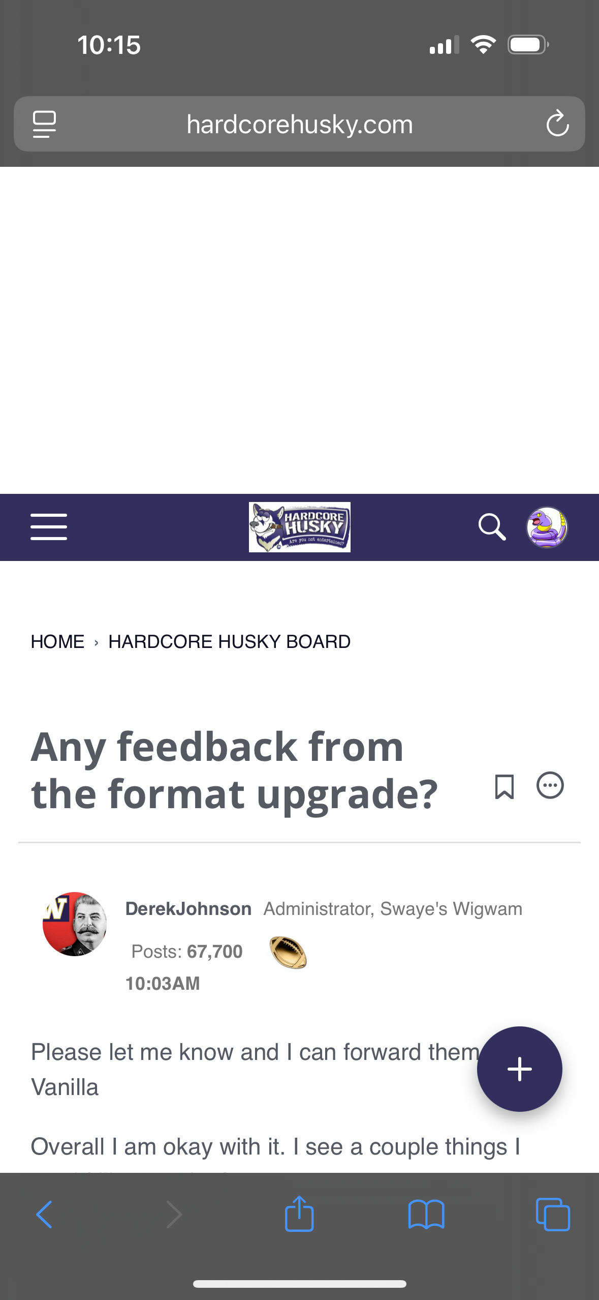
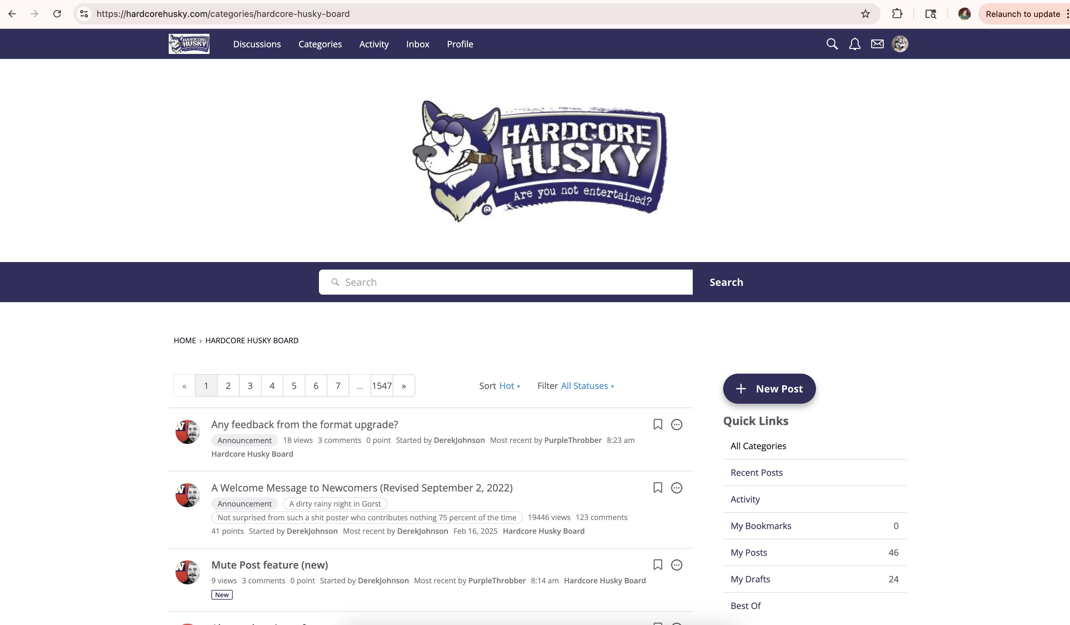
Any feedback from the format upgrade?

Please let me know and I can forward them to Vanilla
Overall I am okay with it. I see a couple things I would like tweaked.
Comments
-
On mobile there’s a massive amount of dead space at the top of the page
-
Not a fan. Vanilla devs need to hit the bottle harder and stop fucking with this shit.
-
Why is the font so gay?
Times New Roman or GTFO.
-
I logged on and almost vomited. WTF. Horrible use of space. Wildly erratic font sizes. I honestly thought it was broken code until I found this post and apparently it's the new way. Well if it's the new way then you can count me out.
-
No button at the bottom to go back
Fuck this shit
-
On mobile, there's font that runs over the banner at the top of the page.
I do like that mobile now has a recent discussions button.
Looks like there are some new ways of sorting threads?
Other than that, I think it has the look and feel of a blog page more than a forum. Seems like the more radical changes are when using the mobile version.
-
Can we get these links at the bottom of pages as well? As much as I enjoy scrolling back to the top.

-
Looks like the banner image in the header is now displaying correctly on mobile so ignore that comment.
-
I like the old format much better because it was much easier to see which threads had new comments on them and less dead space.
-
Don't like it. I think I have only used it on my phone. I'm not sure.
The old format was fine. They needed to clean up the God damn quote feature and links were and still are a pain.