Welcome to the Hardcore Husky Forums. Folks who are well-known in Cyberland and not that dumb.
PWC: Gun violence in America, explained in 17 maps and charts

pawz
Member, Moderator, Swaye's Wigwam Posts: 22,515 
in Tug Tavern
Comments
-
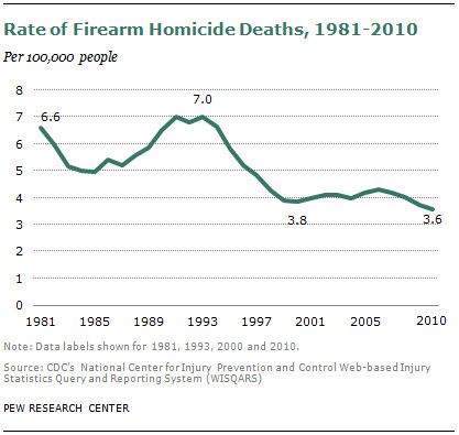
Excellent compilation.pawz said:
This is why my default setting on guns is: people who want to keep things more or less as they are need to show me how to make gun ownership safe by developed-world standards.
Alternatively - treat guns like cars.
-
Paws, I'm curious why you are linking a liberal website. That being said, this chart is telling. I'm curious if anyone knows when the Brady bill was signed and then lapsed correlated with this chart.
-
Vox aren't the sharpest tools in the shed...
If you are going to site Australia's gun suicide rate dropping as a leading example of why you should limit guns shouldn't you do a bit more background research on that (i.e. is it really changing anything)?
http://www.huffingtonpost.com.au/2016/09/27/australias-suicide-crisis-has-peaked-to-a-terrifying-new-height_a_21480647/
-
Chart #5 is telling. Look how low NJ and IL are relatively speaking and that's with places like Chicago and Newark included. And the all white people states like MT and WY are leading the pack.
-
Aussies commit suicide by auto-erotic asphyxiation. Everybody knows that.
Don't change for me.
-
There could be 1 billion charts. Paul Ryan isn't passing meaningful gun control, so that's that.
-
What does @Dardanus have to say?
-
Yes, the Australian gun laws changed in the late 90s. Notice the drop since then until now? Give the chart a different scale. Dullard.HoustonHusky said:Vox aren't the sharpest tools in the shed...
If you are going to site Australia's gun suicide rate dropping as a leading example of why you should limit guns shouldn't you do a bit more background research on that (i.e. is it really changing anything)?
http://www.huffingtonpost.com.au/2016/09/27/australias-suicide-crisis-has-peaked-to-a-terrifying-new-height_a_21480647/ -
'85 - '93 spike in violence, mass shootings, L.A. gangsters shooting uzis at each other, playground shootings, etc. Led to crime bills, assault weapons ban, and passage of Brady Bill.
Progressives conveniently ignore the spike in violence from the drug trafficking gang wars of the late 80's and early 90's when they decry Mass Incarceration and instead blame it solely upon unfair & discriminatory sentencing laws.
Sorry folks, but you can't ignore the facts when making your arguments. -
In order as they appear in the article:RaceBannon said:What does @Dardanus have to say?
1) Infographics are overrated
2) See above (oh they used an icon of a gun...cute! Can't wait to Pinterest it!)
3) Most map charts just become population charts
4) Calendars should always feature bikini girls
5) Too busy
6) Too small
7) Not enough contrast to make an impact. Every state is colored, so you can't easily identify the focal point(s)
8) Grid lines too dotted
9) Line charts don't need data markers
10) Needs more contrast between colors
11) Pie charts are for pedophiles, although kudos for limiting to two slices per pie
12) Visually not bad. Incomplete story as it's lacking the suicide rate for self-immolation over the same years.
13) Another population chart ... worthless
14) Not terrible. Uses a lot of ink to say almost nothing, though.
15) Here, the data labels don't add insight and make an already busy chart busier. Showing % on Y-axis would be a better choice
16) Hard to follow
17) Pretty good, except the "R-D diff" column on the right is unnecessary and distracting