"Hey Derek,
Thanks for sharing that feedback. I understand your concerns, but I really think we would be best to push forward with addressing the feedback on the new theme rather than reverting back.
I know you want to make all of your users happy, but we have to move the theme this year regardless and we don’t want to mislead your users.
I’ve added some notes in green for each of the comments, please let me know if you want to proceed with making these changes on the new theme this week to try to get it to a point where we’ve addressed everything before your conference.
Otherwise we can postpone until just after your conference in August, but not much longer than that.
Please let me know,"
She said that they can:
(hopefully) bring back the yellow highlighted post alert
Provide a back button on the bottom of mobile pages
She said she is not seeing dead space or overlapping text on mobile. Is anyone still seeing it? Please let me know with specifics of O/S and browser
She said they can change it to any font we wish.
Are there any other concerns to be addressed?
Comments
Mobile looks different than yesterday in my Safari browser. Don't see any link to switch from mobile to desktop view or vice versa. It looks closer to the desktop view, which is better for screen use but much smaller default font.
It seems like the mobile version is gone, just gone. What I’m seeing on my phone looks like the full site version.
43AM in Hardcore Husky Board 172.56.105.92
"Hey Derek,
Thanks for sharing that feedback. I understand your concerns, but I really think we would be best to push forward with addressing the feedback on the new theme rather than reverting back.
Fuckoff
I know you want to make all of your users happy, but we have to move the theme this year regardless and we don’t want to mislead your users.
Fuckoff
I’ve added some notes in green for each of the comments, please let me know if you want to proceed with making these changes on the new theme this week to try to get it to a point where we’ve addressed everything before your conference.
Otherwise we can postpone until just after your conference in August, but not much longer than that.
Please let me know,"
Fuckoff
Eembarassing
It seems like there are three different versions going on right now at random.
Yep!
This is beyond unpleasant.
That’s a lot of words to say “maybe just wear your pants backwards next time to allow us easy entry.”
So no matter what you're going to be forced to offer a shitty experience? Not going to be worth it.
”She,” huh?🤔
Should have just copied the v1 rough style/layout into whatever new ShitScript you have to use now if you were going to have to get off of something.
Screenshot this and send it back to her.
Clean up the main page of each section by eliminating the text of the original post and it is almost readable again
Wait it's not a good idea to shove a variable length string into a limited viewport?
We made this same mistake and it was again a PM that argued for changing UI/UX to go after "new types of customers".
maybe we? just move this thing back on to the yuku platform? lmao.
Do we want to find a workable solution or do we not?
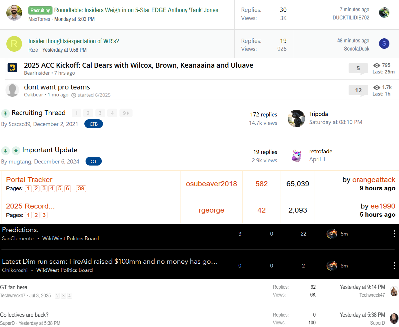
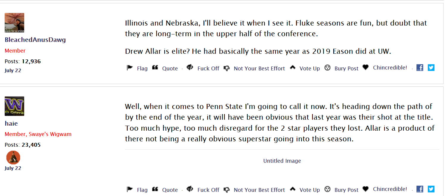
These people have no idea what they are doing. I'm not saying "make it the same as every other site just because" but there's a reason columns and rows are used. Look at the difference between all these shitty sites and vanilla:
vs this zero contrast text diarrhea:
For nobody who cares, the top ones are scoopduck(I know I know) bear inside her, wcsboard, bennyshouse, wildwestsports(no longer geocities, imagine that), and allbuffs.
FFS here are utefans and tiger droppings:
Vanilla should be pumpei my gas but they'd fucked that up too.
@DerekJohnson send these examples and ask them to explain how it's better to have zero delineation, zero contrast vomit even compared to 20 year old free sites.
QA/UX/UI is my job.
THIS(the below) is just fine! Why are you dumbfucks messing around while there are so many bugs? Quoting is broken, replying is broken, etc, etc,
OMG it's almost as if there's a bunch of info that's easy to consume with your fucking eyes because there's a modicum of contrast and a clear delineation between the necessary elements!
KYS Vanilla, KYS!
@dtd
The timing of this latest update really couldn't be much worse. I spent about 4-5 hours over the weekend looking at other sites for host platforms to transfer to. But I didn't see anything I liked well enough and even if I did there's not enough time before we're into fall camp.
There is a plan in the works that was proposed by Vanilla. They are trying to be helpful. I do agree with you that the new layout makes things much harder to read and is not acceptable in the long run.
dude, there's a reason every_single_other_site has a format.
You know what, I mentioned this jokingly a few months ago, I think DJ is Vanilla. This is just another fundraiser drive for lady boi.