Any feedback from the format upgrade?


Please let me know and I can forward them to Vanilla
Overall I am okay with it. I see a couple things I would like tweaked.
Comments
-
On mobile there’s a massive amount of dead space at the top of the page
-
Not a fan. Vanilla devs need to hit the bottle harder and stop fucking with this shit.
-
Why is the font so gay?
Times New Roman or GTFO.
-
I logged on and almost vomited. WTF. Horrible use of space. Wildly erratic font sizes. I honestly thought it was broken code until I found this post and apparently it's the new way. Well if it's the new way then you can count me out.
-
No button at the bottom to go back
Fuck this shit
-
On mobile, there's font that runs over the banner at the top of the page.
I do like that mobile now has a recent discussions button.
Looks like there are some new ways of sorting threads?
Other than that, I think it has the look and feel of a blog page more than a forum. Seems like the more radical changes are when using the mobile version.
-
Can we get these links at the bottom of pages as well? As much as I enjoy scrolling back to the top.
-
Looks like the banner image in the header is now displaying correctly on mobile so ignore that comment.
-
I like the old format much better because it was much easier to see which threads had new comments on them and less dead space.
-
Don't like it. I think I have only used it on my phone. I'm not sure.
The old format was fine. They needed to clean up the God damn quote feature and links were and still are a pain.
-
I was told we’d have clout or karma generating in the new upgrade. I see neither.
-
They get told this every…fucking…time
-
Every update seems to go in a direction away from what customers request.
I thought this was the full site not mobile layout. It's pretty useless as a forum on mobile. Like, actively prohibits users from making use of the site.
Do they even have a product manager? Has that person ever interacted with you or any actual product users ever? Probably some wfh gen z girl blogging from cancun while getting paid $250k per year.
-
It’s gay.
-
The funny thing is that they probably hate us for being one of the 'legacy' customers just as much as we hate them.
UI/UX feels like a mostly copy cat game and people can't think critically so they copy something that's not a great fit.
The thing that companies really need to stop changing is site navigation. You can't improve it after a point, you can only piss people off.
-
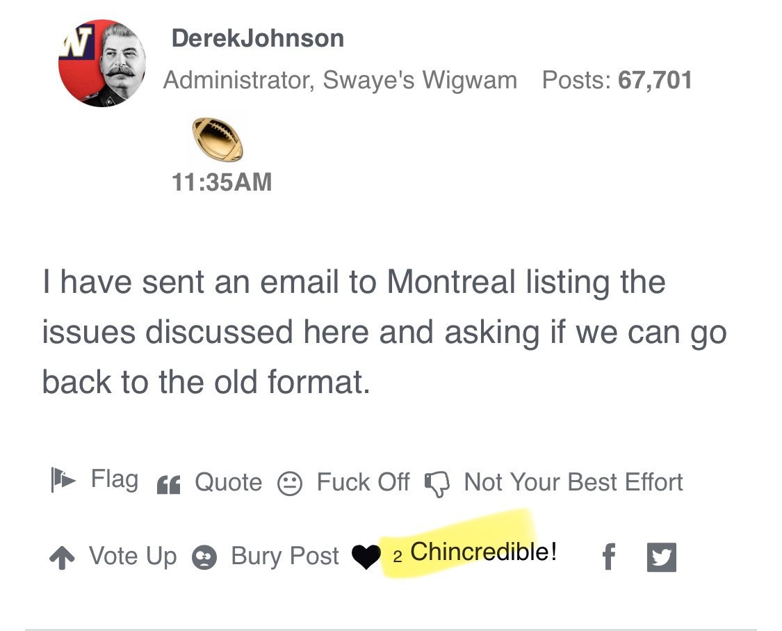
I have sent an email to Montreal listing the issues discussed here and asking if we can go back to the old format.
-
My initial feeling is: I wish it was yesterday!
-
double click turns chin from one to two, third click goes back to one. Never used from a platform other than iPad/iphone.
edit - I keep scrolling down searching for mobile. Guess I’m an idiot because I can’t navigate this shit, I’m out
-
get off my lawn
-